
Peg Design System
v0id-byte/peg-design-system
Framework minimalista para apresentações tipo-dirigidas, sem design tools
Ver no GitHubSistema de design minimalista focado em tipografia para criar apresentações e decks em HTML/CSS/React. Inclui 7 templates de slides, 5 componentes React e tokens de design (cores, tipografia, espaçamento) pensados para apresentações orientadas por dados.
Instalação
npx convez-ai v0id-byte/peg-design-system1 comando no terminal: detecta o formato do repositório (marketplace ou plugin avulso) e instala via Claude Code. Requer Node 18+ e o Claude Code instalado.
Métricas
Casos de uso
- Criar decks de apresentação em HTML com 7 templates prontos
- Prototipagem rápida de UIs com dados tabulares usando React
- Adotar tokens de design (cores, tipografia, espaçamento) em projetos próprios
- Construir apresentações acessíveis que respeitam preferências de redução de movimento
Veredito

Sistema robusto e opinado, extraído de produção real. Perfeito para quem precisa fazer apresentações profissionais em código sem lidar com design tools. Limitado ao contexto de apresentações, não é framework genérico.
README
A tradução para o português deste README ainda está na fila.
Peg Design System — Minimal Slide & Presentation Framework
A type-led, data-first design system for slide decks, web presentations, and React UI components. Built on restraint: one background, one accent, no shadows.
Preview
| Title slide | Types comparison |
|---|---|
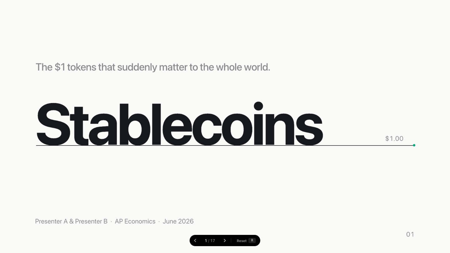 | 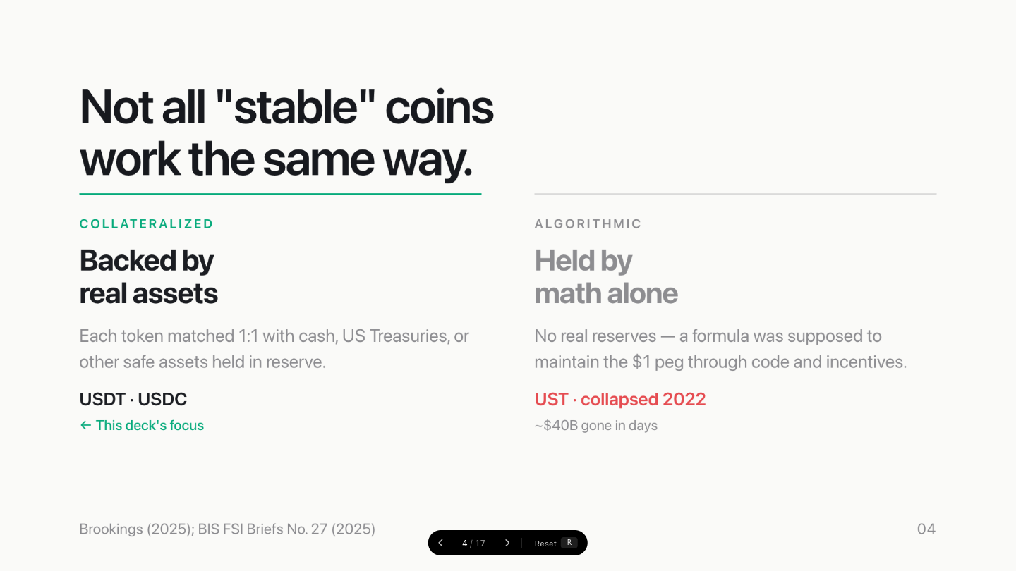 |
| Data comparison table | Mechanism slide |
|---|---|
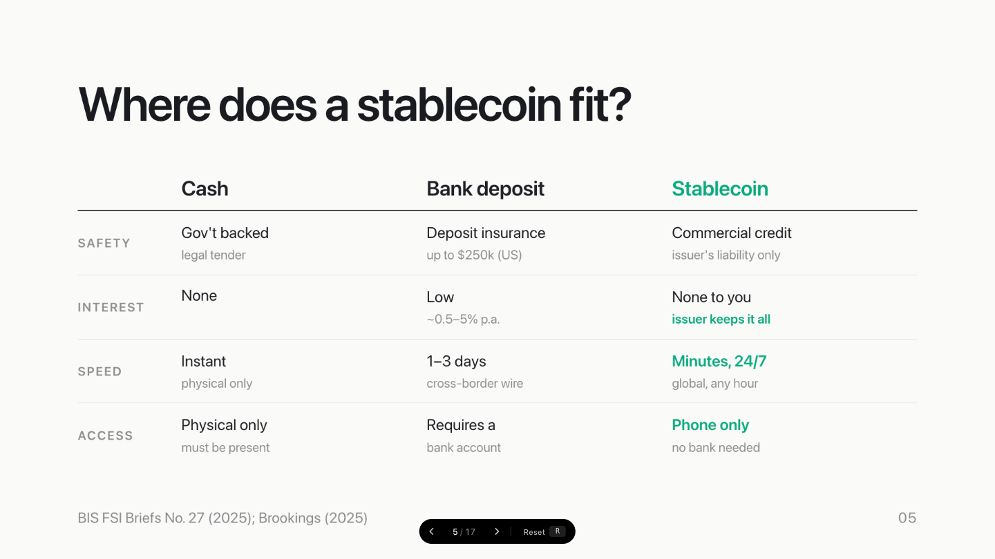 | 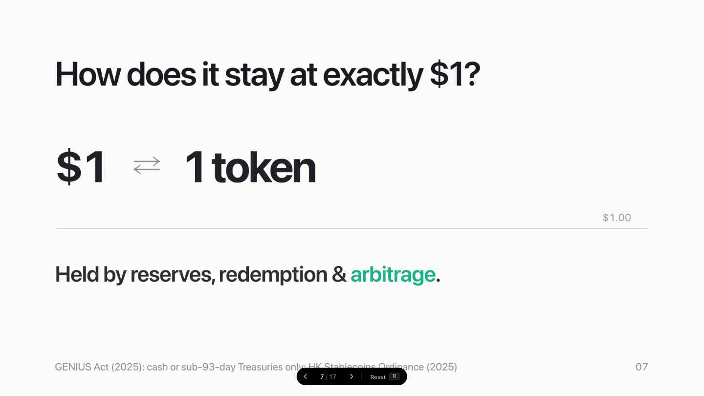 |
English
What is Peg?
Peg is an open-source design system and slide framework extracted from a production presentation deck. It gives you a complete, opinionated visual language for building beautiful, readable presentations in HTML/CSS and React — without touching a design tool. Ships with a Claude Skill (SKILL.md) for direct import into Claude Design.
Key characteristics:
- Minimal palette — 6 tokens, one warm-white background, one jade accent
- Type-led hierarchy — Inter variable font, aggressively negative tracking, no decorative elements
- Data-first — tabular numerals, SVG 2px chart lines, count-up animations built in
- Flat & fast — no shadows, no gradients, no card chrome; content lives directly on paper
- Accessible by default — all animations respect
prefers-reduced-motion; DOM always shows final state
Use Cases
| Scenario | What to use |
|---|---|
| Build a slide deck in HTML | slides/ templates + slides/slide-base.css |
| Prototype a data-heavy UI | components/core/ React components |
| Adopt the design tokens only | tokens/*.css |
| Browse the design language | guidelines/*.card.html |
Seven Slide Templates
| Template | Purpose |
|---|---|
| Title | Deck opener — wordmark + $1.00 peg line |
| Headline | One bold claim + supporting sentence |
| Stats | Two key figures with short descriptors |
| Flow | Left-to-right value or process chain |
| Chips | Labelled category grid with context |
| Attr List | Define something with 3–4 bold-term properties |
| Moment | Centred full-frame question or provocation |
Five Core React Components
| Component | Purpose |
|---|---|
PegLine | The signature $1.00 horizontal baseline |
FlowBand | Arrow-chained flow diagram |
Chip | Bordered pill for key/value metadata |
StatBlock | Large formatted number + descriptor |
AttrList | Stacked property definition rows |
Design Tokens
tokens/
  colors.css      — 6 palette values + semantic aliases
  typography.css  — 7 type roles, tracking, weight
  spacing.css     — spacing scale + 1920×1080 canvas geometry
  effects.css     — line weights, radii, motion curves
  fonts.css       — Inter variable @font-face
Colour Palette
| Token | Value | Role |
|---|---|---|
--color-paper | #FAFAF8 | Only background — warm, never cold |
--color-ink | #16181D | Primary text and lines |
--color-night | #0B0B0C | Stage chrome, outer letterbox |
--color-jade | #00A878 | Single accent — one use per slide |
--color-alert | #E5484D | Danger only — losses, risk, collapse |
--color-mute | #8A8A8E | Labels, footnotes, secondary text |
Typography Scale
| Role | Size | Tracking | Weight |
|---|---|---|---|
| Wordmark | 248px | −0.04em | 700 |
| Hero | 300px | −0.04em | 700 |
| Headline | 92px | −0.03em | 600 |
| Subhead | 60px | −0.02em | 600 |
| Support | 44px | −0.01em | 400 |
| Caption | 28px | 0 | 400 |
Quick Start
<!-- Link the token chain -->
<link rel="stylesheet" href="styles.css">
<link rel="stylesheet" href="slides/slide-base.css">

<!-- Use a slide template -->
<div class="slide slide--headline">
  <div class="frame">
    <p class="label">SECTION LABEL</p>
    <h1 class="headline">A bold one-line claim.</h1>
    <p class="support">Supporting sentence that adds context.</p>
  </div>
</div>
File Structure
styles.css              Entry point (@import chain)
tokens/                 CSS custom properties
components/core/        React components (.jsx + .d.ts + .prompt.md)
slides/                 7 HTML slide templates + base CSS
guidelines/             Visual documentation cards
assets/                 Inter variable font
Design Principles
- One background. Paper (
#FAFAF8) only. No dark slides, no gradients. - One accent. Jade once per slide, maximum. Never decorative.
- Alert is earned.
#E5484Dfor genuine bad news only. - No shadows. No elevation. Content lands on paper.
- Final state first. Screenshots and PDFs always show complete slides.
- Tabular numerals everywhere. No column-width jitter.
- Negative tracking on display text. Tight, not loose.
Motion & Animation
Peg includes a built-in animation engine (peg-animate.js) for Keynote-like entrance effects and slide transitions.
Motion Tokens (in tokens/effects.css)
| Token | Value | Purpose |
|---|---|---|
--ease-reveal | cubic-bezier(0.2, 0.65, 0.2, 1) | Standard entrance easing |
--ease-out-expo | cubic-bezier(0.16, 1, 0.3, 1) | Fast deceleration, snappy entries |
--ease-spring | cubic-bezier(0.34, 1.56, 0.64, 1) | Overshoot spring, for hero numbers |
--ease-in-out | cubic-bezier(0.65, 0, 0.35, 1) | Symmetric, for slide transitions |
--dur-fast | 200ms | Quick micro-interactions |
--dur-normal | 400ms | Standard UI transitions |
--dur-slow | 820ms | Default build animation duration |
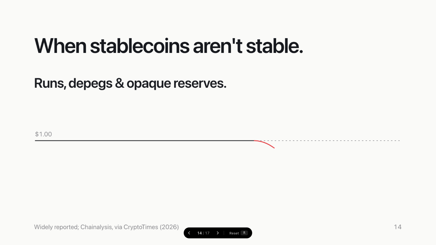
--dur-draw | 1400ms | SVG path drawing (e.g., depeg chart) |
--dur-page | 500ms | Slide transition duration |
Build Animations (Entrance Effects)
Add data-peg-animate to any element inside a slide:
| Type | Keyframes | Best For |
|---|---|---|
fade-up | opacity 0→1, translateY(22px)→0 | Default for text, containers |
scale-in | opacity 0→1, scale(0.8)→1 | Hero numbers, wordmarks |
blur-in | opacity 0→1, filter blur(8px)→0 | Background elements |
reveal-right | opacity 0→1, translateX(30px)→0 | Flow nodes, list items |
letter-spring | each character opacity 0→1, translateY(0.72em)→0 with spring overshoot | One-line title or moment slides |
text-flip | opacity 0→1, translateY(0.42em)→0, rotateX(-82deg)→0 | Calm single-line text reveal |
Delays: Use data-peg-delay="80" (ms) for individual timing.
Stagger: Add data-peg-stagger="100" to a parent for automatic sibling delays.
Letter stagger: Use data-peg-letter-stagger="34" (ms) for per-character timing.
<div class="headline" data-peg-animate="fade-up" data-peg-delay="80">Title</div>
<div class="hero" data-peg-animate="scale-in" data-peg-delay="200">$306B</div>
<div class="headline" data-peg-animate="letter-spring">A one-line moment.</div>
<div class="chips" data-peg-stagger="100">
  <div class="chip" data-peg-animate="fade-up">Item 1</div>
  <div class="chip" data-peg-animate="fade-up">Item 2</div>
</div>
Open letter-spring-demo.html to preview the per-character title reveal.
Backward compatible: .build.d1 through .build.d5 classes still work (mapped to fade-up with 80/200/320/440/560ms delays).
Count-Up Numbers
Add data-peg-count or use .count class with data attributes:
<div class="stat-n count" data-to="306" data-pre="$" data-suf="B" data-cdelay="360">$306B</div>
Data Bars
Add data-peg-bar to bars or use .bar-fill / .progress-fill. Horizontal bars grow left-to-right; vertical bars grow bottom-to-top.
<div class="bar-fill" style="width:72%;"></div>
<div data-peg-bar="vertical" style="height:180px;"></div>
Use data-peg-bar-duration, data-peg-bar-delay, and data-peg-bar-easing for local timing overrides. The resting DOM remains the final value for screenshots, PDF, and PPTX export.
Slide Transitions
Add data-peg-transition to <section> (slide) elements:
| Value | Effect |
|---|---|
dissolve | Crossfade (old fades out, new fades in) |
push-left | New slides in from right, old slides out left |
text-flip | Old slide flips upward while the new slide flips in from below on the same timeline |
none | Instant cut (default) |
<section class="paper" data-label="Title" data-peg-transition="text-flip">...</section>
Transitions respect prefers-reduced-motion and are disabled when noscale is set on <deck-stage>. Open transition-demo.html to compare cut, dissolve, push-left, and text-flip.
Initialization
<script src="deck-stage.js"></script>
<script src="peg-animate.js"></script>
<script>
  PegAnimate.init('deck-stage');
</script>
License
MIT — use freely in commercial and personal projects.
中文
Peg 是什么?
Peg 是一套开源设计系统与幻灯片框架,从一套生产级演示文稿中提炼而来。它为你提供完整、有主张的视觉语言,让你用 HTML/CSS 和 React 构建美观、可读性强的演示文稿——无需打开任何设计工具。包含 Claude Skill(SKILL.md),可直接导入 Claude Design 使用。
核心特点:
- 极简配色 — 6 个色彩 token,一种暖白背景,一种翠绿强调色
- 以字排版为核心 — Inter 可变字体,强负字间距,零装饰元素
- 数据优先 — 等宽数字、SVG 2px 图表线、内置数字滚动动画
- 扁平快速 — 无阴影、无渐变、无卡片边框;内容直接落在纸面上
- 默认可访问 — 所有动画尊重
prefers-reduced-motion;DOM 始终展示最终状态
适用场景
| 场景 | 使用内容 |
|---|---|
| 用 HTML 制作幻灯片 | slides/ 模板 + slides/slide-base.css |
| 原型设计数据密集型 UI | components/core/ React 组件 |
| 仅引入设计 token | tokens/*.css |
| 浏览设计语言规范 | guidelines/*.card.html |
七种幻灯片模板
| 模板 | 用途 |
|---|---|
| Title(标题页) | 封面——品牌字标 + $1.00 基准线 |
| Headline(主张页) | 一句粗体核心论点 + 补充说明 |
| Stats(数据页) | 两组关键数字 + 简短描述 |
| Flow(流程页) | 从左到右的价值/流程链 |
| Chips(分类页) | 带标签的分类网格 |
| Attr List(属性页) | 3–4 条粗体术语定义列表 |
| Moment(转场页) | 居中全屏问句或论点 |
五个核心 React 组件
| 组件 | 用途 |
|---|---|
PegLine | 标志性 $1.00 水平基准线 |
FlowBand | 带箭头的流程图 |
Chip | 带边框的键值标签胶囊 |
StatBlock | 大字号数字 + 描述文字 |
AttrList | 堆叠式属性定义行 |
设计 Token
tokens/
  colors.css      — 6 个调色板值 + 语义别名
  typography.css  — 7 种文字角色、字间距、字重
  spacing.css     — 间距比例 + 1920×1080 画布几何
  effects.css     — 线宽、圆角半径、动效曲线
  fonts.css       — Inter 可变字体 @font-face
配色方案
| Token | 色值 | 用途 |
|---|---|---|
--color-paper | #FAFAF8 | 唯一背景色,暖白 |
--color-ink | #16181D | 主文本与线条 |
--color-night | #0B0B0C | 舞台边框、外侧信箱区 |
--color-jade | #00A878 | 单一强调色,每张幻灯片最多使用一次 |
--color-alert | #E5484D | 仅用于危险/损失/风险场景 |
--color-mute | #8A8A8E | 标签、注脚、次要文本 |
设计原则
- 只有一种背景:Paper (
#FAFAF8),无深色页、无渐变页。 - 只有一种强调色:Jade 每页最多出现一次,不用于装饰。
- Alert 色需要理由:
#E5484D仅用于真实的坏消息。 - 无阴影:无高程层级,内容直接落在纸面。
- 最终状态优先:截图与 PDF 导出始终显示完整幻灯片。
- 等宽数字无处不在:防止列宽抖动。
- 标题文字强负字间距:紧凑而非松散。
快速开始
<!-- 引入 token 链 -->
<link rel="stylesheet" href="styles.css">
<link rel="stylesheet" href="slides/slide-base.css">

<!-- 使用幻灯片模板 -->
<div class="slide slide--headline">
  <div class="frame">
    <p class="label">章节标签</p>
    <h1 class="headline">一句醒目的核心论点。</h1>
    <p class="support">补充一句上下文说明。</p>
  </div>
</div>
动效补充
大标题页的一行字可用 data-peg-animate="letter-spring",每个字母/汉字会从下方逐个弹性甩入并渐现,适合 Keynote 风格的 moment slide。用 data-peg-letter-stagger="34" 调整逐字间隔。
<div class="headline" data-peg-animate="letter-spring">A one-line moment.</div>
如果需要更克制、无弹性的单行文字翻入,可用 data-peg-animate="text-flip"。
<div class="headline" data-peg-animate="text-flip">A calm upward reveal.</div>
打开 letter-spring-demo.html 可预览逐字标题动效。
数据柱、横条、进度条可加 data-peg-bar,或直接使用 .bar-fill / .progress-fill。横向默认从左到右增长;竖向使用 data-peg-bar="vertical",从底部向上增长。
<div class="bar-fill" style="width:72%;"></div>
<div data-peg-bar="vertical" style="height:180px;"></div>
可用 data-peg-bar-duration、data-peg-bar-delay、data-peg-bar-easing 单独调整时长、延迟和曲线。DOM 保持最终数值,截图、PDF、PPTX 导出不显示半成品。
页面切换可在 <section> 上添加 data-peg-transition="dissolve"、data-peg-transition="push-left" 或 data-peg-transition="text-flip";text-flip 会让旧画面向上翻出,同时新画面从下方翻入,两个动作在同一时间轴上连贯进行。不设置时为默认瞬切。切换动效尊重 prefers-reduced-motion,并在 noscale 导出模式下关闭。打开 transition-demo.html 可对比 cut、dissolve、push-left、text-flip。
<section class="paper" data-label="Title" data-peg-transition="text-flip">...</section>
许可证
MIT — 可自由用于商业及个人项目。